
9 Popular Colors to Add to Your Interior Design
9 Popular Colors to Add to Your Interior Design
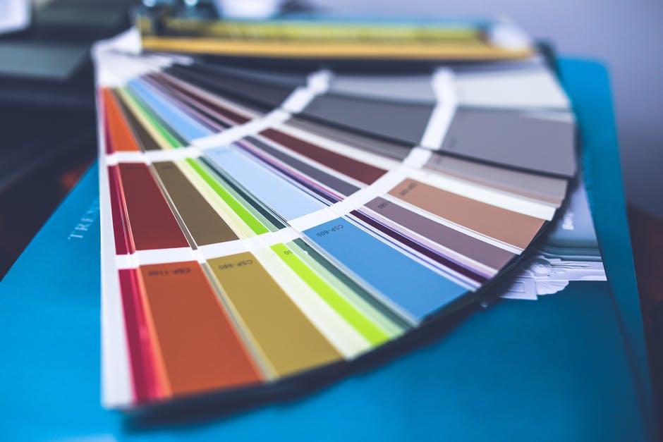
Keeping up with the latest interior design trends is important if you want your home to be as up-to-date as possible. Even when it comes to colors, they can come and go with time. Perhaps your grandmother was rocking mauve and spruce green back in the day. Well, times have changed and so have our spaces.
That said, let’s take a look at what color trends are currently in…
1. Crimson
If you love any of the berry colors – reds, purples, blues – you may love the idea of crimson being one of the hottest color choices of 2018. Crimson is a darker shade of red but is still vibrant enough to not put you to sleep. However, too much crimson can be overwhelming.
Consider opting for crimson cushions for dining room chairs, throw blankets or pillows, or kitchen appliances. We probably wouldn’t recommend going for crimson walls unless you’re completely in love with the vibrancy and boldness of this trending color. However, crimson can be an excellent color for an accent wall in a game room or bedroom.
2. Yellow Finch
Yellow is beautiful, but it’s also on the warmer and more eye-sensitive side of the color spectrum. But if you want a healthy dose of yellow in your space without making it appear too bold, go for the color yellow finch. Yellow finch is a muted down yellow that almost appear to have hints of tan. It would make an excellent color for a beach house, that’s for sure!
Yellow finch kitchen walls, bathroom towels, or candles can all make a beautiful statement in any space. Some may also like yellow finch-colored pillows for a bright and cherry family room or living room.
3. Olive
Olives are not only healthy and delicious in flavor but offer one of the most beautiful colors of 2018. If you can’t decide between green or brown in your space to make it more earth-y in tone, go for olive which offers a nice mix between the two. But if you’re more of a neutral type of person, it doesn’t hurt to go towards a more gray-ish toned olive, which would be considered an olive drab.

Regardless of the shade of olive you go for, olive pendant lights, vases, accent walls, and curtains are incredible. Because olive tends to be a darker color, most aren’t too fond of using it to paint their entire walls or to opt for olive furniture, unless, that is, it is an olive shade that is less deep and bold.
4. Blush
Those who love tans, beiges, and pinks will adore the color blush. This hue, while pink, is so soft that many don’t think of it as an incredibly “feminine” color in space. It provides a statement while still keeping on the down-low in an interior design.
Blush is an extremely versatile color. Opt for blush pillows or blankets, rugs, candles, walls, vases, or light fixtures in bedroom, bathroom, or living/family room. There are several different blushes out there from softer, paler shades to ones that are more orangey or slightly on the mauve side, depending on the color your space in particular needs.
5. Starry Night Blue
If you want a little Vincent van Gogh inspiration in your interior design, go for Starry Night Blue. It offers the same intense medium-blue found within van Gogh’s famous, magical painting, Starry Night. Best of all, this color pairs very well with other shades of blue if you wish to go for a monochromatic color scheme within your design.
Choose Starry Night Blue accent walls, plant pots, vases, rugs, lamps and other light fixtures, and the like. As an added bonus, consider implement a copy of van Gogh’s Starry Night to match the Starry Night Blue décor items you make use of in your home!
6. Sand
Forget tan or beige. Instead go for the color sand. You don’t have to have a beach house to feature this beautiful neutral in your home. Sand can be used along different bolder colors to provide a beautiful balance in your interior design. Pair sand with teal, forest green, or ocean blue to add more earthiness to your space.
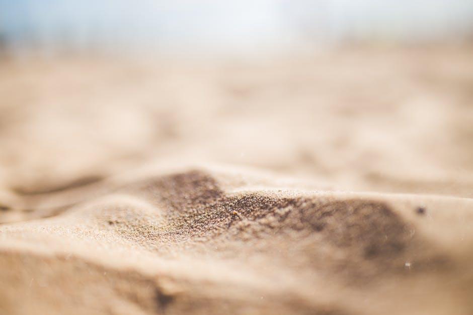
Sand can be used anywhere in your space and look fantastic. Consider sand-colored walls, stone, cabinets or tables, wood flooring, picture frames, or plant pots. Sand can look great in any room from the formal dining room to the guest bathroom.
7. Ice Blue
For a softer, cooler color in your space, you may love the idea of adding ice blue to your design. Feature ice blue alongside other blues, greens, grays, or purples. Add silver as an accent metal. Ice blue can be as playful or as elegant as you like.
Ice blue looks gorgeous for bathroom or bedroom walls, as a backsplash in a kitchen with white cabinets, for vases and plant pots, or even for rugs. There are different shades of ice blue that may be more relevant for all seasons if you don’t want a wintry feel in your home all year ‘round.
8. Deep Purples
This is obviously a pretty broad category, but there are several shades of deeper purples that are all the rage right now. Popular purples include: ultra violet, amethyst, wine, purple-gray, lilac, orchid, and fuchsia.
Purple is an incredible color and can be as red or as blue as you’d like. Best of all, it is the color of royalty and is the perfect hue to add some sophistication to your dining room or master bedroom. Add purples in the form of accent walls, cabinets, or general décor. Go as dark or bold as you wish with your choice of purple(s).
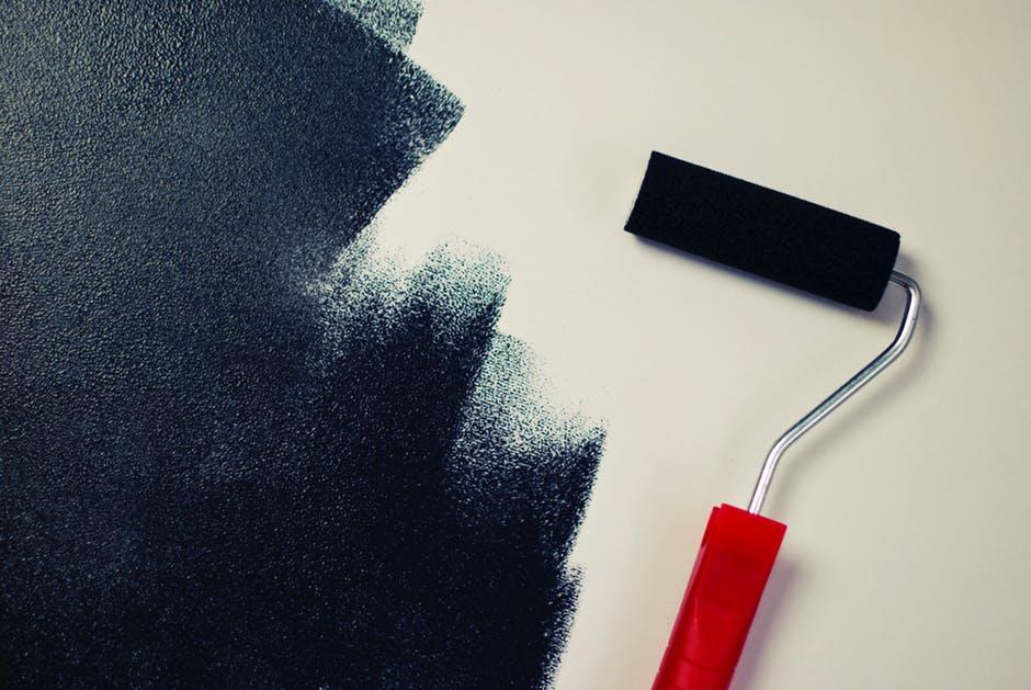
9. True Black and Matte Blacks
Not all blacks are all. There are blacks with a blue base, red base, and so on and so forth. But trending right now are blacks without any undertones. These blacks can look nice as accent pieces, or if light enough, for walls. But keep the blacks in your space to a minimum, and add other bright colors such as crimson or yellow finch to your space!
Matte blacks are also in. Really, matte in general is in. You may be aware that some paint companies have been coming out with true matte paints quite recently that offer a non-glossy, very flat texture and appearance. They make a space look very sleek, clean, and modern.
Conclusion
Based on the above color trends, it appears that different shades and blues and purples, pastel or brighter versions of traditionally louder warmer-spectrum colors, and colors that are more neutral in the form of beiges or pale pinks are a hit for interior design today. Of course, part of picking colors for your interior design is using the colors that you personally love. But when it comes to trends, you may come across a color you never heard of or thought of implementing into your design. It’s a great way to become acquainted with different colors.
If you’re looking for some colorful light fixtures to help you complete your fresh design making use of trendy colors, you’ll want to check out Cocoweb.com. We offer all sorts of lights including, but not excluded to, barn lights, floor lamps, and much more!
Recent Posts
-

How to Choose the Perfect Painting for Your Home or Office
When it comes to decorating your space, choosing the perfect painting can be a game-changer. A well- …7th Feb 2025 -

How Post Lights Improve Home Security and Safety
How Post Lights Improve Home Security and SafetyWhen it comes to securing your home and enhancing sa …9th Jan 2025 -

The Best LED Gooseneck Barn Lights for Different Architectural Styles
When it comes to outdoor lighting, barn gooseneck lights are a timeless classic. Their vintage cha …12th Dec 2024